- Coding Project
- Design Project
-
-
kittichoteshane@gmail.com
I started graphic design when I was a first year university student. A lot of students start new things when they became university students since they have a lot of free time and I am one of them. I learned about design theories and how to use adobe illustrators. However, I didn’t have real experiences on designing real-world stuff. That is why I started this challenge to get my hands dirty on designing close-to-real-world logos. It was a 30-day logo challenges. Basically you get an email from a fictional client every single day for 30 days. Some of them give some particular conditions, some give your more freedom to design. Please enjoy.
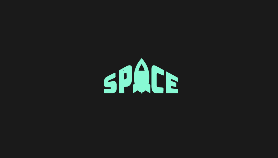
"Hey Designer! I'm Mary, the project coordinator at Space. We're so happy to have you work on our logo design! Space is building co-working offices so that freelancers and small startup companies have a stunning office to work out of without paying the big bucks to buy or lease a large building. We offer rentable offices for teams of 1 to 12 in beautiful areas across the world including Austin, New York City, Raleigh, Chicago, San Francisco, and London. These offices are also great for people working remote for larger companies. For the Space logo, we want to capture the idea of a personal, modern, and fun shared office space. We would be open to some kind of icon or using the text "Space" to represent the company. We don't have any requirements in terms of colors, text, icon, or otherwise. Have fun with some ideas! And if this helps, some of our competitors are Industrious and WeWork."
This is the first day of the challenge. I personally like the design of the logo. However, is doesn’t really correspond to what the company is doing. The name of the company is space which refers to space as distance but does not have anything to do with celestial stuff. However I somehow put a spaceship as a logo lol
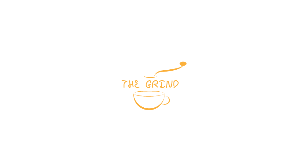

"Hi there, We're a small coffee shop chain located in Seattle, WA with five locations. Our current logo is just text using a default font but now it's time for an update! The Grind prides itself on natural and local ingredients. For our new logo, we actually do not want to use any browns! So many coffee shops around here use brown and we'd like to stand out. Maybe oranges, green, other earth tones, etc. could work well. This logo will primarily be used as our store sign, on menus, and on coffee cups and merchandise. The Grind logo could be text based or have an icon, we're open to either/both. We're open to using symbols that represent coffee such as the coffee bean, plant, grounds, coffee cup, etc.! I'm attaching a few example of logos we really dig for some inspiration. We like a somewhat clean look."
Honestly, this is one of my most most dislikable logo. How could I design this lol. The difficult thing about this challenge is that it you cannot use brown color which is a typical color for coffee. I personally like orange so I use it for the logo which was a big mistake. I literally use the word ‘grind’ and make the logo to be something ‘grind’. Which didn’t work well.
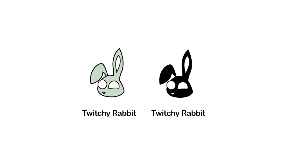
"Hiya! Amber here and we're excited you're taking on our logo redesign. Attached below is the current logo for Twitchy Rabbit. The problem is that it's too detailed and doesn't work great as our logo, especially at small sizes, and this is something we want to improve on. Twitchy Rabbit is an email marketing platform similar to MailChimp and Twitchy the Rabbit is our mascot. We'd like him to be redesigned into a more simple, iconic form that we can use across our products. We are willing to accept a solid color logo or something with multiple colors, as long as it works great a small size around 50x50 pixels for icons."
I kinda like this one due to it’s simplicity which is exactly what the task it. I do wish I could make it more simple though.
"Good morning, Ping is thrilled to be working with you. As you know, Ping is a growing chat platform for businesses and small teams. Some of our biggest competitors are Slack and Skype. What sets us apart is that we offer major features like group screen sharing, free of charge. Our logo needs be text-based, focused on the word Ping. Feel free to explore icons that are aligned with the name but the name needs to be included. We are open to any color scheme but would like to stay away from blues if possible. We're also open to any kind of typographic style and graphical style."
This one is not bad but I don’t like it somehow. The design is so general and the logo is kinda too bright. I, myself, would not want to use the service of this company if I see this logo for the first glance.

"Hello! Thanks for the chat today. Wildlife™ is happy to have you on board! We're a non-profit organization that preserves the life and habitat of wild animals throughout the world. Our organization is known for our passion and personal investment in the lives of animals. Similar to the the WWF logo, we would be happy to use one animal to represent our brand or several, it's up to you. We do require a stand-alone icon for the logo that can be paired with text, although text is not required for this stage. Outside of an animal icon logo, we do not have any requirements at this time."
I like this one pretty much. Firstly, rhino represents endangered animal well. Secondly, the background kinda gives the feel of Africa in which there are a lot go animals, especially endangered species.
"Greetings! 1-800-Rosebud is an online flower shop which sells bouquets of flowers and gifts for any special occasion! We're looking for a logo that represents a flower or flowers along with our name, 1-800-Rosebud. We're open to any colors but prefer something warm over cooler colors (blues, black, etc.) Since this logo also features our phone number, the wordmark needs to be legible at large and smaller sizes. Finally, it does not necessarily need to be a rose, but roses are welcomed as well."
I think that this logo is not so bad or not so good. However, I could not imagine any real flower shops really use this logo for their stores because it is too comic-like. I wish I could have it more natural-feeling.

"Yo! Stoked that you're creating the Austin Run logo! We're a large running event that happens once a year in Austin, Texas. We had over 5,000 participants last year and now it's time to get some great branding materials. Austin Run is a charitable event for autism research and raises money for families in need of care, education, and information. The event is so much fun and many people dress up in crazy outfits. Last year we had someone dressed as Darth Vader followed by 50 Storm Troopers! Anyway, the logo style is really up to you and we'd love to see what you can come up with. It could feature the Texas state shape, a landmark that represents Austin, something that represents running, or even just a text logo! Feel free to something whacky and fun or something more simple. I'm sure we'll love whatever you do!"
This is a nice logo but I feel like I would not feel like running seeing this logo. It gives a feel of unprofessional somehow.

"Hello! Glad to connect with you. Sparked is a video game news website featuring the latest news in all video games, esports, and tech. For our logo, we're looking for something that works on a dark background. This logo cannot have a light or white background. We're possibly thinking of something that uses orange, red, or yellow and features a spark, fire, flame, etc. The Sparked brand is all about hot gaming news, so we want our logo to represent that. Feel free to check out a few examples attached for inspiration."
I'm not a gamer but I think that did pretty well for this one. Using multiple blocks representing bits really gives a feeling of game. Moreover, having console’s buttons in side the spark make the logo looks more fun !

"Hey there, Excited to be working with you! We've seen some of the previous logos you've designed and we are really impressed. Paint™ is a fantastic mobile app that allows you to take a photo of anything and it will automatically pull up the correct color in multiple formats including Sherwin Williams Paint, PANTONE Color, and many more. We're looking for a redesigned logo that is visually appealing. I've attached our current logo below but we think it's too bland. It really lacks some color which is what our app is all about. We'd be open to a text based logo or one that has an icon. The most important thing is that it's colorful, whether it be one color or multiple. Can't wait to see what you come up with!"
I think the design is normal but I really like the color theme of this. Pastel color is nice and kinda give feeling of paints

"Hello, Anchor is a clothing line for the nautical lovers! Many of our products are actually produced with recycled boat sail material. We're looking for a fairly simple logo that of course features the iconic shape of an anchor. While blue is obvious for color, we'd like to try something outside of blue. We want to be more modern and fun and don't want to use something so expected! This logo will be used on our shirts, polos, pants, tags, and all other types of apparel. Feel free to go any direction with text, but it is not required at this time unless the logo is part of the text."
I tried to make the anchor look like a letter ‘A’ which stands for Anchor. However, I did not really look like an anchor. However, I kinda like the font though. I kinda give the feeling of navy.

"Hello there! Pleased to be working with you. I'm in the final steps of opening a candy shop in the UK called Sweets. Yep, a pretty awesome and straight forward name! We'll offer a very wide variety of candy; just about anything you can imagine. I would love for the logo to capture the joys of candy whether it be with an icon, colors, etc. You can try a lollipop, wrapped candy, chocolate, etc. There are really a lot of different things that could represent Sweets, so long as the text "Sweets" is legible from a far distance as this will be on our sign. I would please ask that the words 'Candy Shop' are below the main name 'Sweets'. "
This logo is one of my favorite. I really like the color which gives a sweet taste somehow. Also, the font really looks like a real candy products like chupa chups. Maybe I actually got inspired by chupa chups logo that while it looks pretty similar.

"Hi! Sword & Shield is an upcoming security system for tech companies. Our software includes password protection, server backups, malware protection, and more. We're focused on appealing to medium to large scale technology companies. For our logo, we'd of course love to feature a sword and shield! Our team has discussed some ideas but we'd love to see what you come up with first. We ask that the logo be provided in both a dark background and light background style. Thanks so much!"
I have to admit this is one of the messiest logo I have even seen in my life. Look at those lines. I tried to make it look like a network and it really those. However, this is too much for a logo. This is supposed to look like a sword and a shield at the sae time but i ended up did not look like anything at all.

"Hey there, We are so excited that you're taking on our rebrand! JJ Pizza has been serving the Chicago area with the very best pizza since 2002. We're rated #1 for the area and now it's time to step up our game! I've attached our current logo (please don't laugh!). It was created when we first started but there is nothing unique about it. It's just something I put together a LONG time ago and it's time for something fresh. I want to our exact red color as the main color whether it's a red logo or a white logo on a red background. Reason for this is because a lot of this red is painted on our walls, our cups, etc. and if we can keep that red, we can save some money. The red color required is this hex code: #DF4337 That's the only requirement I can think of. You can try a pizza icon, the letters, whatever you want! Looking forward to seeing what you can do!"
I really like this one too. I use the J’s letter to make the shape of pizza which is kinda cool. However, I also thought that it would be better to have a more appetite-drawing pizza such as those which have cheese overflowing.
""Good morning, Thanks for taking the time to chat. BookWorm™ is a growing online bookstore and we're looking to get a logo designed. I'm not really good at this kind of stuff so I don't know how much help I can be. We just want to see what you can come up with. We're pretty much open to anything, whether it be using a worm or not. We do need the text BookWorm to be included of course. Thanks!!"
The worm is cute. I was actually not so good at drawing living-things but I think I did pretty well for this worm.

"Hello! Pups is a new online subscription service focused on dog food, toys, and medicine delivery. Our users sign up for weekly or monthly delivery of premium dog food straight to their door! While a large bulk of our subscribers are for dog food, we also deliver toys, treats, and medicine. We don't want our logo to be focused around dog food but more around dogs/puppies! For the Pups logo, we require the text "pups" as well as either a separate or integrated icon of a puppy or dog(s). We're so excited to see what you come up with!"
I presonally like dog but I don't really this logo. It doesn't really look like a logo, rather a drawing. I think it’s better to be something more modern and simple.

"Hi there, Sharp has been creating high quality cooking knives for over a decade. We're known for our craftsmanship, quality, and outstanding cuts. We provide a variety of knives from chef to bread, and we need a new logo to represent our quality. We'd like our logo to be black and white, no colors please. We like logos that focus on minimalism and feature very subtle details. Thanks so much!"
This logo is super simple but it is one of my most proudly presented. The cut represent letter sharp which is the initial of the company. Making the line pretty think also gives the feeling that the kinfe is pretty sharp.

"Hello! We're very excited to be working with you on the Fast branding! Fast is an online form generator where users can generate and interact with any kind of form like W9, contracts, etc. It's perfect for freelancers and home business. We'd like the word Fast to be the logo, with perhaps an icon that represents paper or a form. We also require it to be either blue or orange. Thanks so much!"
This is one of my most dislikable logo in this challenge. I tried to make each block look like a form block but it wasn’t a really good idea. I will redesign this soon.
"Hey! I own a sushi bar in downtown Los Angeles and looking for a fresh logo! The name of my shop is called Sakura. This means flowering cherry (blossom) tree, so I'd actually be cool with using a cherry blossom, but please don't feel that you need to use this, just an idea! I am definitely open to any other kind of sushi iconography. I do require that the name Sakura is included in the logo. Thanks!"
This one is not so good or bad in my opinion. It gives the feeling of Japanese. However, the sign is so general it doesn’t really look like logo. But now that you think about it, most real world restaurants do not have so unique logo.
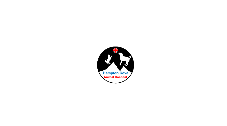
"Hello! We're thrilled to see what amazing work you can do for the Hampton Cove Animal Hospital. The Hampton Cove area is known for it's mountains, so we'd love to incorporate some mountain(s) in the logo somehow, maybe in the background. The main focus of course should be pets/veterinary/animal hospital. If you look around the internet you can find a lot of great examples of animal hospital logos and we'd love something similar to them with the uniqueness of using mountains to represent the area we're located in! Thanks!"
this logo is not my style at all. It looks really serious somehow but that’s why I think it kinda fits with a hospital since it’s a place to protect lives. I would prefer it to be more friendly looking though.
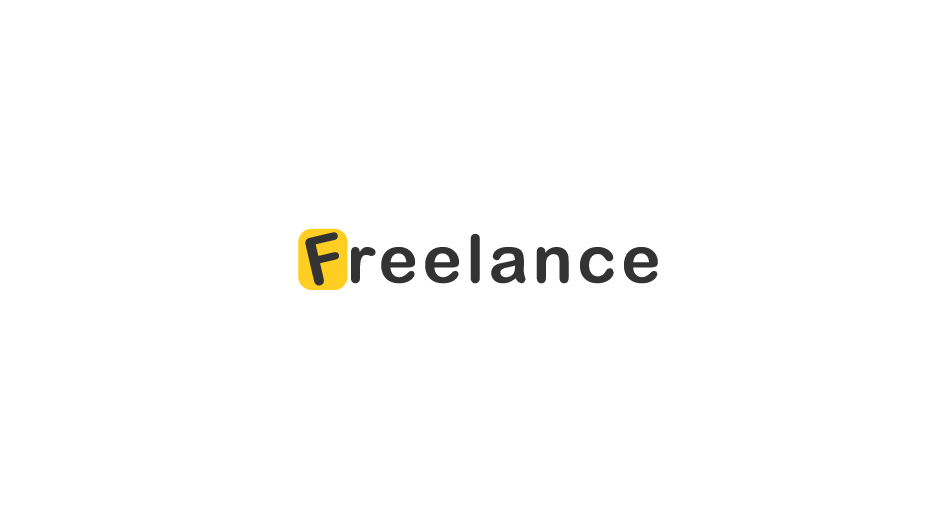

"Hey there, Freelance is a company for people just like you actually! We're an online system that helps freelancers (designers, artists, and all other creative types) manage their invoices, time, projects, client communication, etc. in one suite. What we imagine for this logo is just the text Freelance. We can't think of any icon or symbol that would encompass all creative types. We wouldn't want the logo to be a pen tool icon or some other graphic design specific icon. We need the logo to be versatile in that any freelance person can connect with it. If you can think of an icon that will work, go for it! If not, we'd really love to see just a really clean type-based logo with our name. Thank you!"
This logo is simple and I really like it. Now I understand what does ‘Less is more’ really mean. The font is nice, the color is nice too.
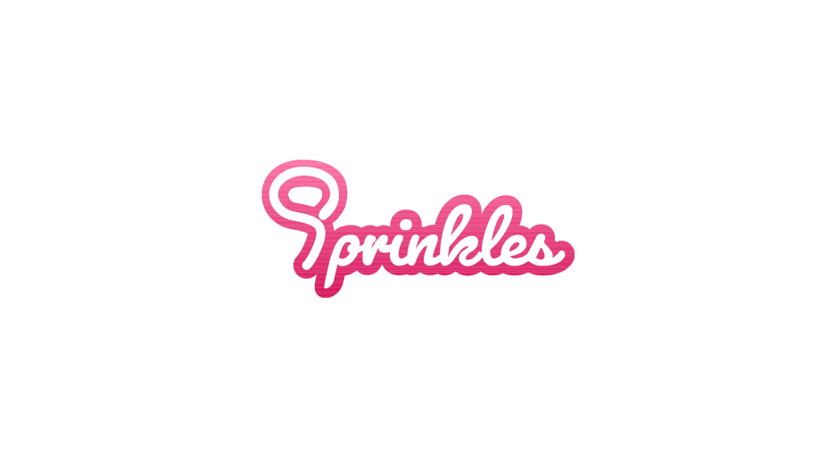

"HELLO! Ice cream. It's what we're about and we want the logo to scream ice cream (see what I did there?) Sprinkles is an ice cream shop with stores across the United States. We pride ourselves in the best tasting ice cream on the planet. We've won numerous awards for our taste and innovative flavors. We're like the Willy Wonka of ice cream.For the logo, we require the text "Sprinkles" and then some kind of icon or visual element to represent ice cream and/or the sprinkle topping. We want bright, fun, and tasty!"
This is an ice cream shop so I tried to make the letter ’S’ look like a shape of ice cream. However, it ended up not looking like either an ice cream or the letter ’S’ lol. I personally like the color of this design since it gives you the feeling or huger somehow.

"You've almost made it through the entire Thirty Logos challenge series! Feels pretty awesome, right?! We hope you've learned, improved, been frustrated, been excited, and above all, felt challenged. Let's take a little break from the client directed challenges and try something different. We'd like to focus on you. As a designer, do you have your own personal logo? If not, design your own at this point for Challenge #22! If you have a current logo, are there ways you could improve it? Perhaps there are some ideas you can try for a new look?"
I used to wear that kind of glasses, a round harry potter like glases. However, I do not war tat anumore since it got to old. I would still like to wear it though. I real face is not this cute by the way.
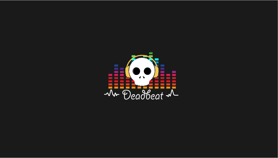
"Hey there, Deadbeat is an online music community focused on EDM, Drum & Bass, House, Dubstep, etc. type of music. Our close competitors for your reference are Monstercat and 99Lives. We'd like our logo to focus around the dead + beat idea. Dead could be a skull or zombie and the beat (music) featuring either headphones or music equalizer styles. For the style, we prefer something colorful like 99Lives album art. Something when someone sees the logo and just wants to listen to some awesome music!"
I personally like music and I think i did pretty well for this one. the skull represent the business name and the background beat also really make it looks musical. having colorful background makes it more fun and that what music is for !!
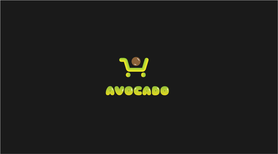

"Hi! Avocado is an upcoming app for smart grocery shopping! Our bundle includes a mount for your phone to attach to the handle of your grocery cart/buggy and will scan each item as you put it in your cart. This keeps track of all kinds of awesome data including total price, calories and other nutritional information, recipe ideas based on what's in your cart, and more! We need the logo to include both an icon and text, please! We also ask that you provide what the app icon would look like with the logo. Thanks!"
I like avocado and I like this logo too! The font is so cute and the color can’t be nothing else but avocado. Guacamole !!
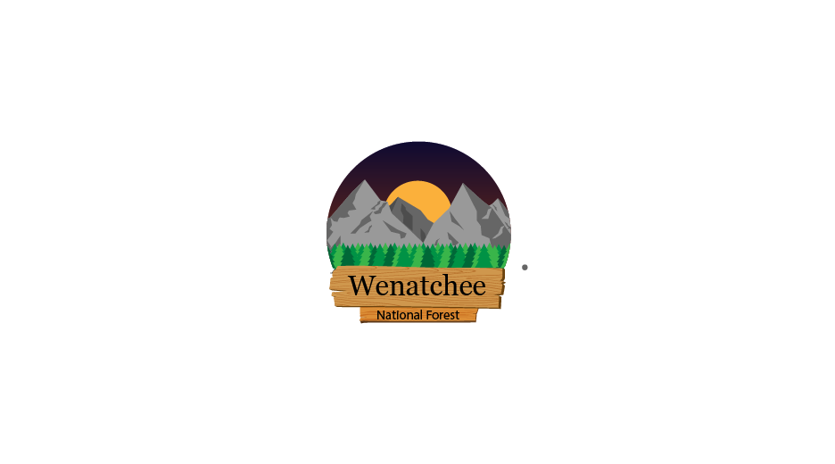

"Hello! The Wenatchee National Forest is home to beautiful mountains, water, and hiking trails. You can see some photos here. We need a logo to represent the forest and the amazing mountain views. This logo will be used by the forest staff including advertising for camping, staff uniforms, website, etc. I have attached a few examples of logos we like, and we do require the full name Wenatchee National Forest. The text "National Forest" can be smaller and underneath "Wenatchee" if needed. Thanks so much! We're excited to see what you design."
This logo does not actually look like a logo since it is so in-detailed. However, I like it. I like nature. The wooden name board, a Rocky Mountain, trees, and a night sky seem perfect to me.
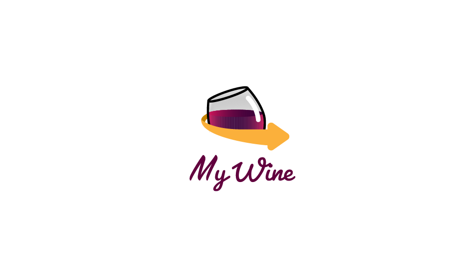

"Hey there, My Wine is a new online service that delivers premium wine to your doorstep. You choose from a variety of tastes and preferences to pair up with your dinner plans. We're not sure exactly what direction to go in for this, but we do know we require a merlot red color. Somewhere around the #81151c color range. We are also considering something that represents delivery but it's not required. Thank you!"
I am not so sure about this logo. The color and logo itself is pretty nice. However, the arrow extremely looks like amazon logo too.
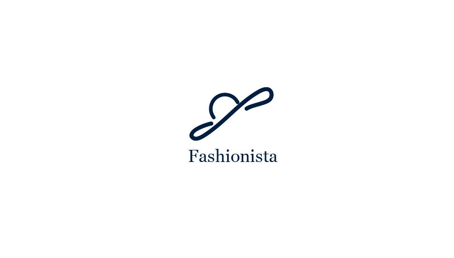
"Greetings, We're so happy to work with you on our logo. Fashionista is a women's fashion app that pairs your current wardrobe with amazing deals at local stores around you. For example, a user could enter in two pairs of jeans and one yellow shirt, and our app will return with other clothes that pair well with the those jeans and shirt as well as complimented outfits. We love the simple look for logo designs. One color background with a white logo would work well for us, especially for the app icon. We do need the logo to work as just an icon so that we can use it for our app."
This one is super simple and I kinda like it pretty much. I intentionally design it to look like a hat but I am not sure whether other see it as hat too. I use serif font for this logo to make it look the brand looks more elegant and I think it does look kinda elegant. I think it would be nice to make the hat looks more professional by making the line smoother and thinner.
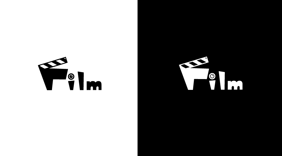

"Hi there, Very pleased with your portfolio and logo work. FILM is a non-profit supporting film students with scholarships, free trips, etc. to reach their career goals. We've helped many well-known directors while they were students including some who had blockbuster success. The name FILM is the fist name of the four founders: Frank, Isabella, Logan, and Maria. We four have been involved in the film industry for decades and now need our non-profit to have a great logo. We'd like you to create a logo that is black and white, whether it be a black background with white logo, or white background and black logo. We are happy with an icon and text or typography that includes subtle hints of film/cinema. Thank you and we look forward to seeing your creation!"
This is one of my most favorite of all time, it’s a film production company and you can understand at the first glance of the logo that it is ! I use the cut scene thingy to make a letter F which fits perfectly !
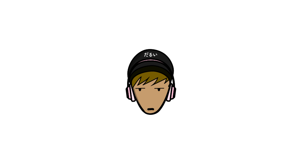

"Hello! Travis here and for this final challenge, let's change things up just one more time! We see logos everywhere we look whether we're driving around, browsing the internet, etc. In fact, I bet if you look around right now, you could find at least 3 logos. I count1 at least 20 from where I sit. For this final challenge, I'd like you to redesign a logo of your choice. This could be your uncle's burger shop, an app you use that nobody knows about, or even something as known as the Nike logo (I don't recommend that though haha)."
This is also one of my most favorite one. My friend asked me to design a logo for his blog-site for him. He uses his face as the model which looks exactly like this logo. 「だるい」literally means 'cumbersome' which is exactly his personality too. He always listen to music with his beat earphone so I added to the logo too.
I think that most of the logos I made give the feelings of small business and are mostly unprofessional. In realy world, I feel like people don't really put the business type into the logo so straighfoward. For example, the google logo is only the text google, not a zoomglasses for searching, or amazon doesn’t use the river amazon in its logo. Apple does have an apple though which is really modern and simple. I would like to make more logos which are simple but elegant at the same time too.